


From the impactful launch of a new brand in the market to the attentive dialogue with passionate consumers on social media, our team approaches each plan methodically, relying on research and analysis to develop the best strategy and the most remarkable creation, yielding results that speak for themselves.
Food marketing experts
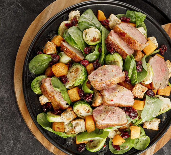
We’ve completed over 10,000 projects for food processors like you, from visionary startups bursting with new ideas to large international corporations ready to make their mark in a Canadian market always eager to discover new flavours.
110
clients
+ 10,000
projects
1992
creation year
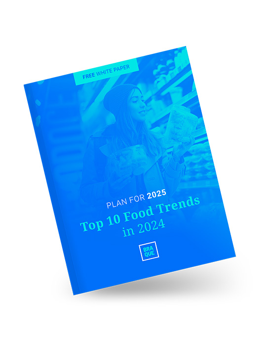
Are you ready for 2025?
Download our free white paper on the 10 trends impacting food processors in 2024.
This white paper spans over 20 pages filled with the latest trends, offering a comprehensive review that covers everything from consumer habits to product development and marketing.
Be ready for 2025!