Iora brand image and packaging

Braque was mandated by the Érablière les Sucreries d’Or to develop the identity and support the market launch of its newly minted premium quality organic maple syrup brand, Iora. The syrup is produced at a sugar bush at the foot of Mont Orford in the Eastern Townships by an environmentally conscious owner-producer.
Iora looking to conquer the European market
The particularity of this mandate is that Iora’s products are destined for the European market. The challenge therefore was to develop a brand image that would attract the attention of this international market and reflect the premium quality of the product line.
Preparing an international launch
Braque began its collaboration with Iora before the product was manufactured, in order to help establish the brand foundation. Several elements had to be considered before the design stage. The agency collaborated closely with the client/business partner to determine the brand history, study the characteristics of the European market and manage the logistics of an international product launch. Since there are numerous factors that can accelerate or stall such a launch, this strategic planning phase was essential.
A refined image for premium quality products
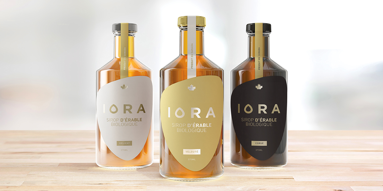
In order to stand out on the shelves, the products needed a striking, unique brand image. Braque also wished to evoke the excellence of the terroir and artisanal production, two characteristics in which the brand takes great pride.
Using the shape of drop of maple syrup as inspiration, Braque first designed a logo and graphic style in the product’s image: simple, elegant and refined. For the packaging, the agency proceeded to create a sleekly designed label which reinforces the Iora line’s premium positioning. The label was then adapted to suit the various bottle sizes and the three syrup grades – delicate, velvety, and full-bodied – offered by the brand.
Tools and results
Various tools were also developed to support the marketing of the new brand at international trade missions and fairs.
A strong, original and elegant visual identity that effectively communicates the brand’s premium positioning.


