Petit Brûlé Brand Identity
Branding
Packaging
A look into an award-winning food branding project for Petit Brûlé ecological farm.
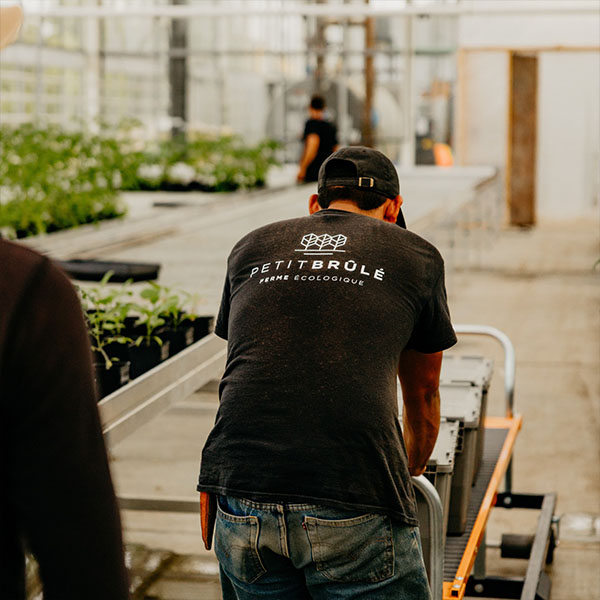
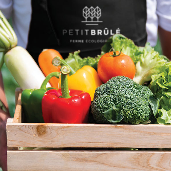
Petit Brûlé is a sustainable agroecological farming project developed by two young entrepreneurs from Rigaud, in the Montérégie region, on a country road of the same name. The farm offers its clients a wide variety of fresh and processed products, as well as the possibility of renting a plot of land so that everyone can grow their own food.
A double challenge
Petit Brûlé entrusted Braque with the creation of its brand identity. It had to be young, urban and modern, in line with the company’s target audience.
This mandate entailed two main challenges. First, to develop a unique identity that would allow Petit Brûlé to distinguish itself from all the other farms in the Montérégie region, nicknamed the “Garde-Manger du Québec,” or Quebec’s Pantry. In addition, the image had to be designed in such a way that it could appear on the full range of products manufactured and sold by the organization.
Modern rurality
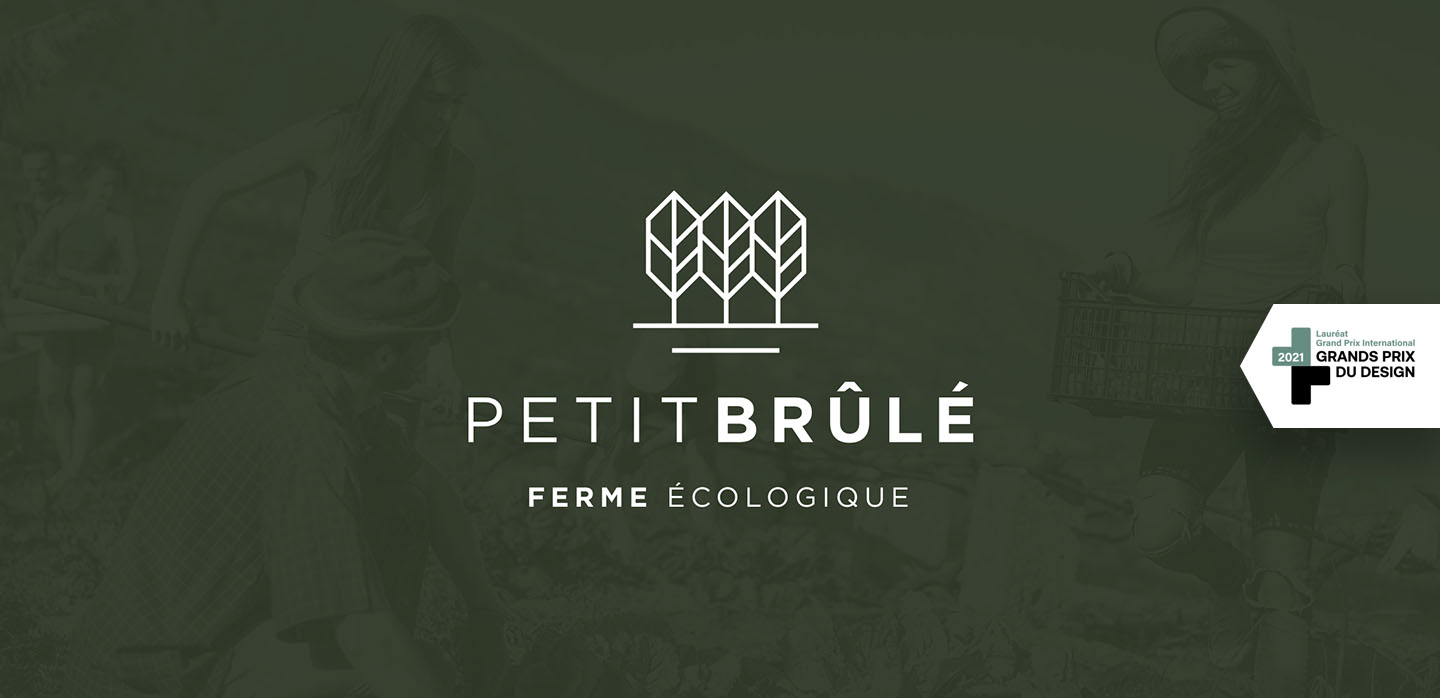
“Petit Brûlé” was first put forth as a name for the project, in honour of the road on which one of its co-owners grew up and the place where the farm began.
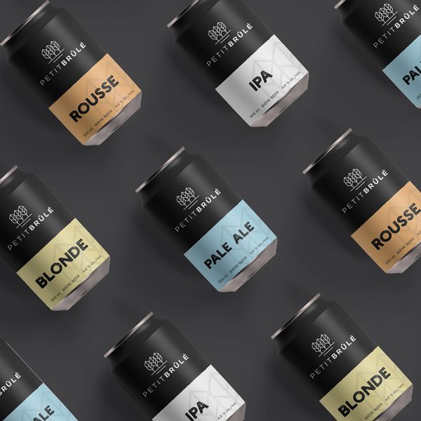
As for the visual identity, Braque opted for a clean, minimalist, and trendy logo that conveys the organization’s desire to modernize agricultural practices.
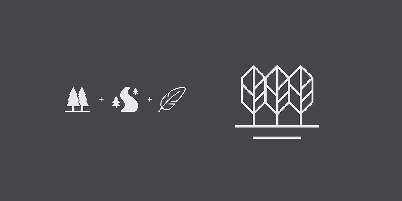
The logo also presents various elements characteristic of the farm’s territory. It shows the Petit-Brulé road as well as trees whose shape is reminiscent of bird feathers, a nod to the fact that Rigaud is the ornithological capital of Quebec. Note that all the lines are perfectly equal, forming a harmonious and well-defined whole.
The result is a chic, urban and flexible brand image that works equally well to represent market-fresh produce or a brand of microbrewery beer.
The visual identity of the Petit Brûlé ecological farm also won the International Grand Prize at the Grands Prix du Design competition.