Jessica Pastries, the art of reinvention
Packaging
Branding
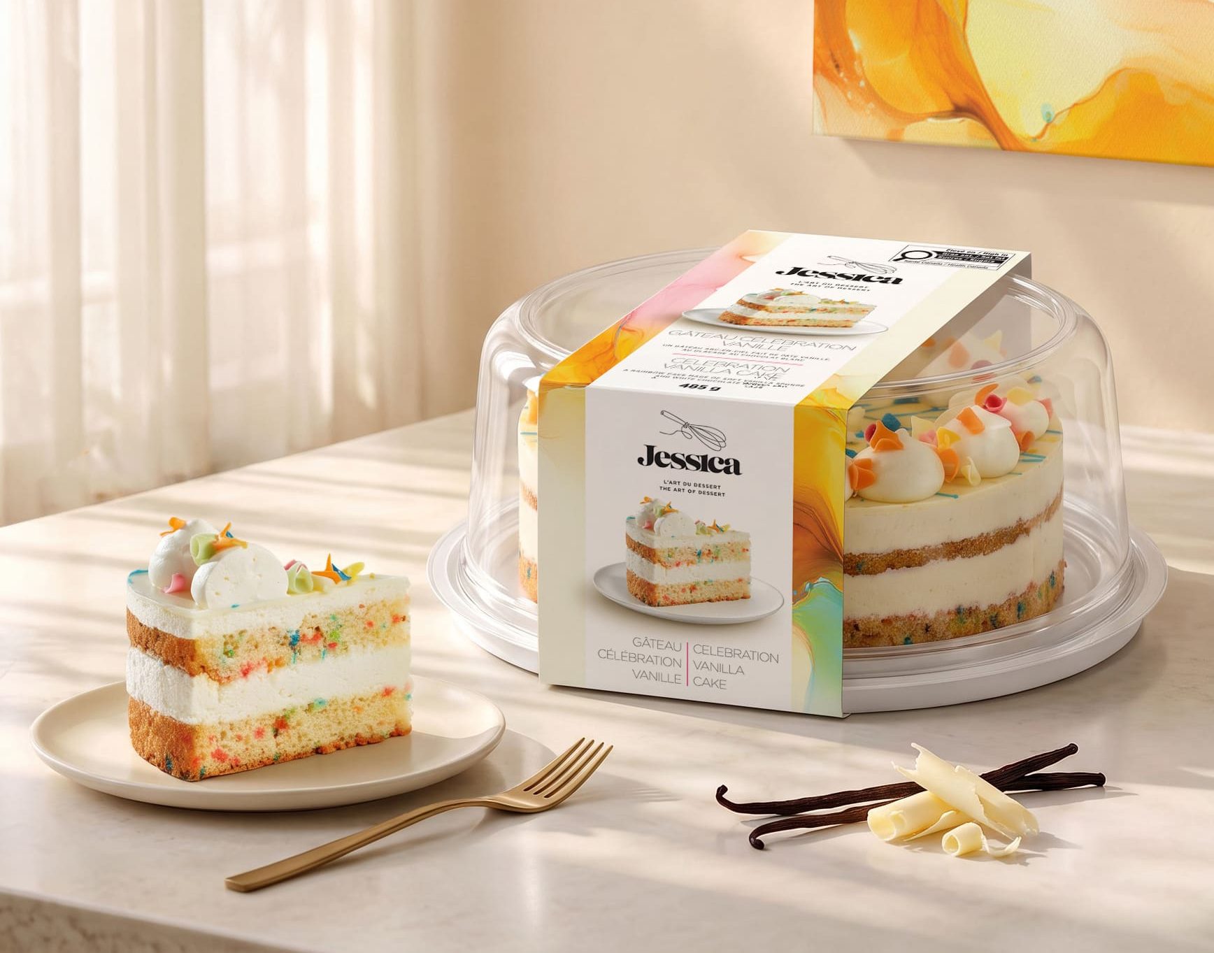
For more than 25 years, Jessica Pastries has been developing and manufacturing desserts for major grocery chains. Well established in the private label market, the company wanted to give its expertise greater visibility by renewing its own brand. It entrusted Braque with creating a new identity and new packaging that would convey the quality of its products and support its ambitions in the North American market.
Bringing the brand behind the products to light
Recipe development and the ability to produce consistently at scale made Jessica Pastries a partner to food retailers. This expertise, well recognized in its business relationships, now needed to speak more clearly to consumers.
The rebrand therefore served a dual purpose. It needed to build preference in grocery stores and strengthen the company’s position with major retail banners. A distinctive identity would make its products easier to recognize, while giving retailers one more reason to include them in their assortment.
Making refinement accessible
The challenge was to communicate a premium positioning in a mass retail context. The brand image had to reflect the care given to the recipes, the textures and the presentation of the desserts, while remaining warm and approachable.
The brand also needed to broaden the occasions associated with it. Beyond the birthday cake, Jessica wanted to be part of dinners with friends, family gatherings and everyday treats. This ambition called for an identity versatile enough to bring together a variety of products and formats, without relying on the visual codes of a single celebration.
The art of dessert as a guiding idea
The approach was built around the connection between pastry making and artistic expression. The brand manifesto links the work with ingredients, the mastery of textures and the attention to detail with the belief that refinement can be enjoyed simply.
The tagline “The Art of Dessert” gives this positioning a concise form. It evokes both the expertise required to make the pastries and the pleasure of presenting and sharing them.
This idea provides a common thread for the brand renewal. It makes it possible to talk about quality through concrete, sensory elements, while establishing a visual world that goes beyond the conventions of industrial pastry.
An identity that connects craft and indulgence
The new identity pairs the Jessica name, set in an expressive typeface, with a whisk drawn in a fine line. This tool recalls the pastry chef’s gesture and roots the brand in its trade.
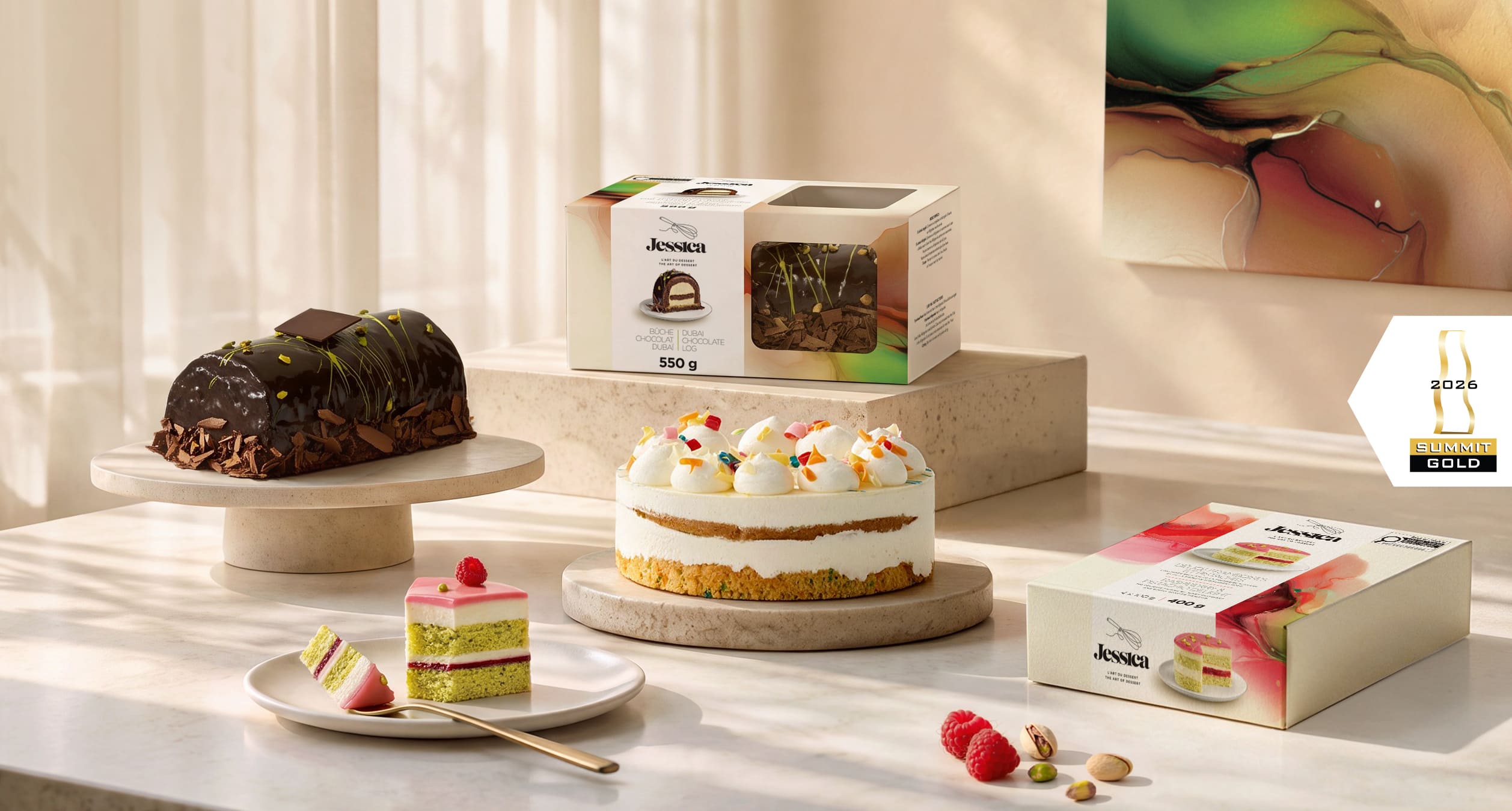
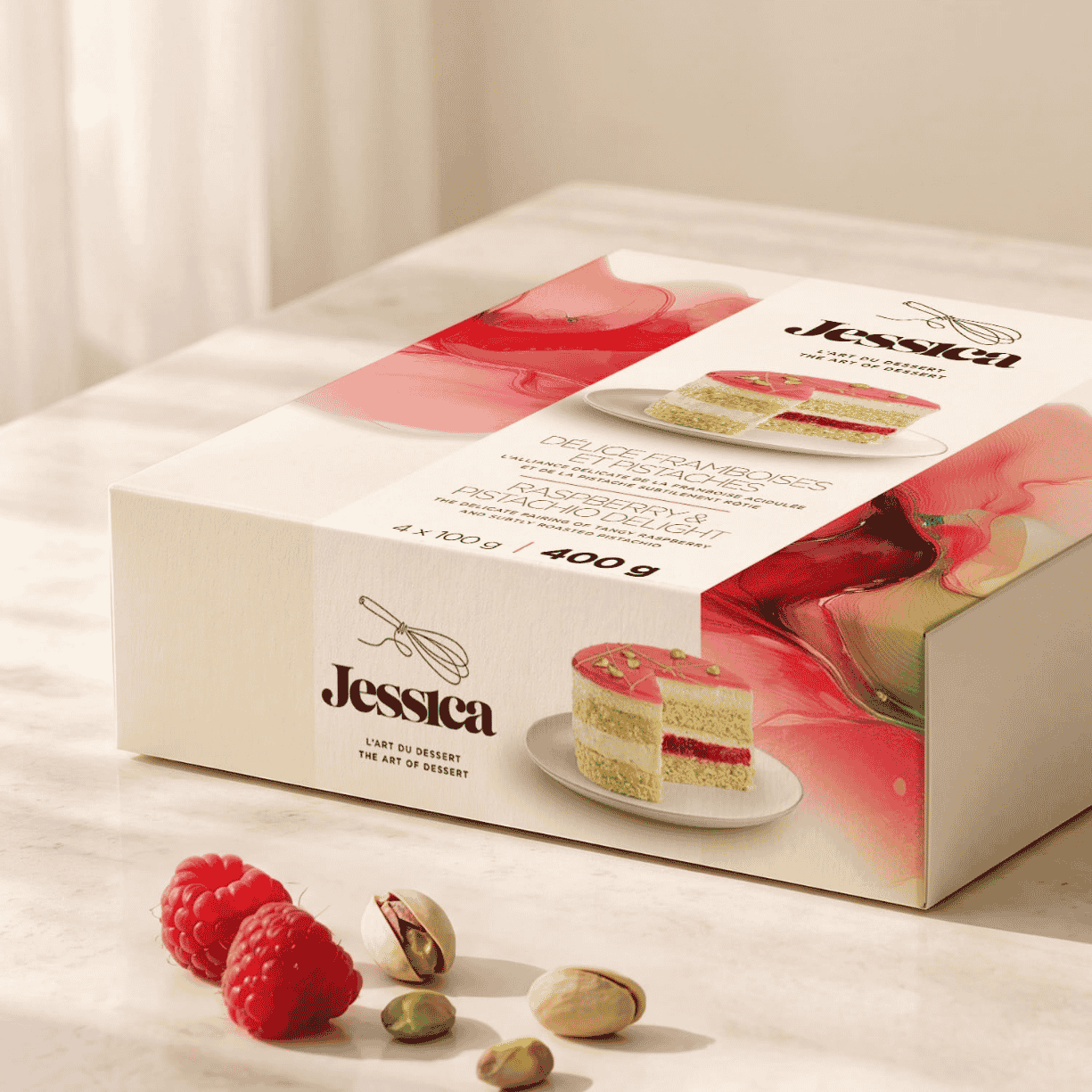
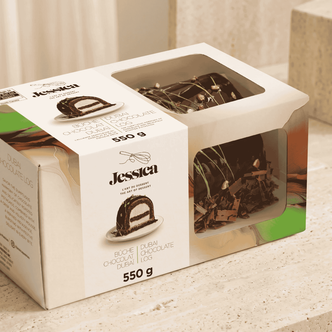
On the packaging, abstract compositions in fluid colours extend the artistic reference. Their hues echo the flavours, with browns and greens for the Dubai chocolate log cake, then pinks and reds accented with green for the raspberry and pistachio delight. This approach gives each product its own personality while maintaining a visible kinship across the product lines.
Light surfaces structure the information and leave ample room for photographs of the desserts. Sliced portions reveal the layers and fillings, while the windows on some packages let consumers see the product itself. Altogether, this brings the brand promise closer to what consumers are about to enjoy.
A system designed for multiple formats
The mandate included redesigning the logo and the packaging, developing graphic standards guidelines and adapting the system to the various planned formats.
The range of applications included window boxes for log cakes and rectangular cakes, boxes for cakes and mini cakes, sleeves for domes of different heights, dome labels and the acetate bands wrapped around the cakes.
This diversity called for an adaptable graphic structure. The brand, the photographs, the bilingual product names and the product information had to maintain a consistent hierarchy despite changes in dimensions and available space.
A presence worthy of the product
The new image gives Jessica Pastries a shared set of cues for presenting its offering and building recognition among consumers. It brings to light an expertise that had until now been expressed mainly through its partners’ products.
For Braque, the work involved translating this expertise into a renewed identity, then ensuring its consistency down to the practical constraints of packaging. A way to support Jessica’s ambitions by placing the quality of its desserts at the heart of its identity.