New branding for Sana food brand
Branding
Packaging
Candy manufacturer Sana called upon Braque for a new branding that would help increase its brand awareness and grow its presence with food retailers.
Sana is a Canadian sweets manufacturer, crafting ketogenic chocolate products. With no added sugar and filled with good fats, Sana’s treats fit into a balanced lifestyle that combines well-being and pleasure. The company’s mission is to guide people towards healthy eating without compromising on taste.
Since its foundation in 2019, Sana has experienced significant local growth, but felt ready to expand beyond the province and conquer new markets. Originally named “Kétolat,” the brand had a limited scope to be able to reach English-speaking consumers. Therefore, the company turned to Braque to find it a new name and a new visual identity that would help increase its visibility and carve out a prominent place among retailers across the country.

The assignment
Braque first looked at the name. After coming up with several elaborate ideas, the choice was clear: “Sana”, a short and catchy name that works well in any language. The team then got to work on the new visual brand identity, including the logo and packaging. The objective was to create an image that would convey the company’s mission and, at the same time, appeal to consumers.
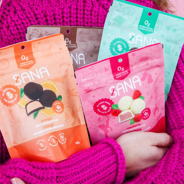
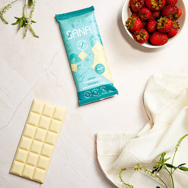
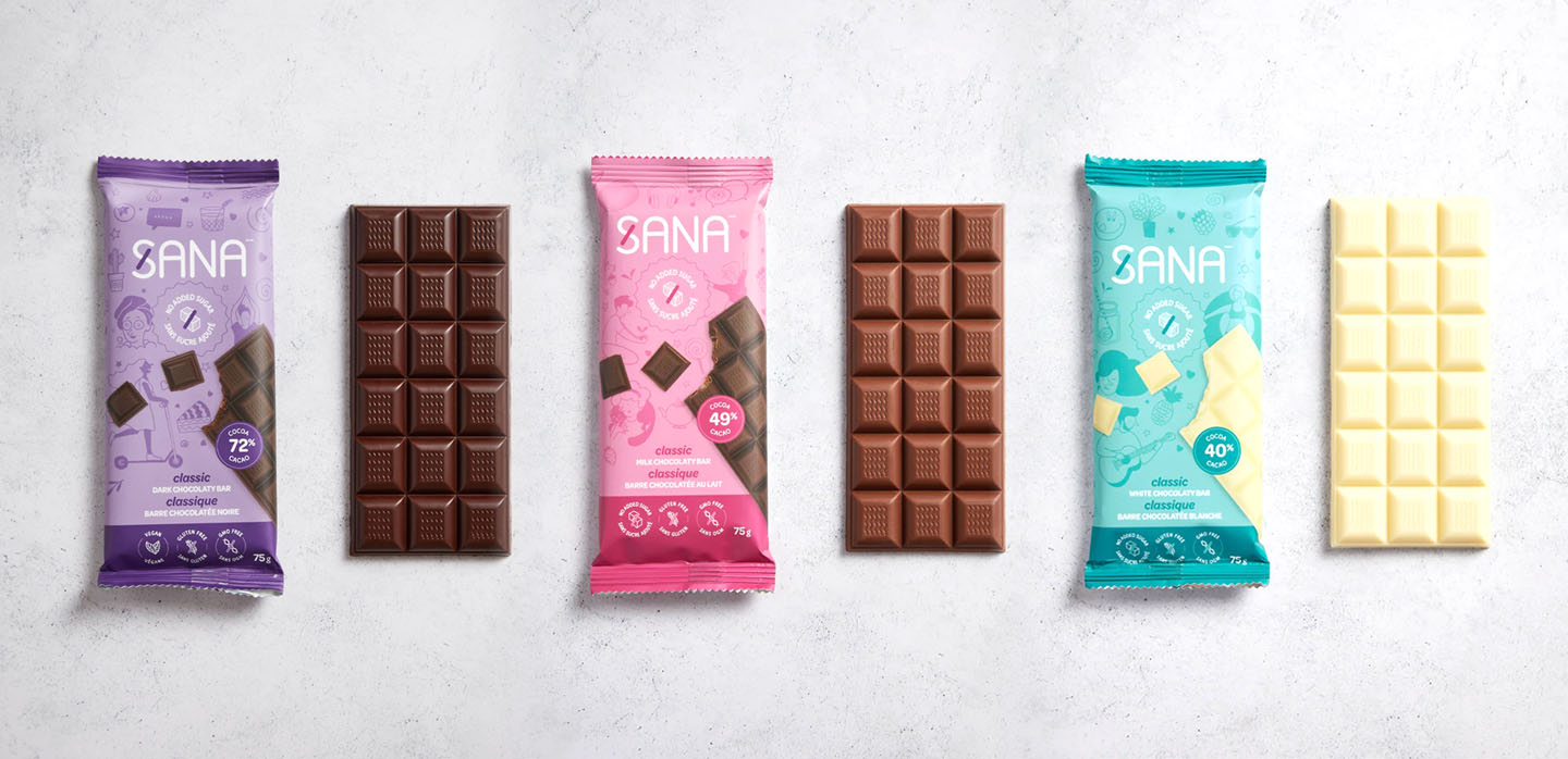
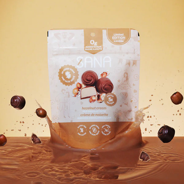
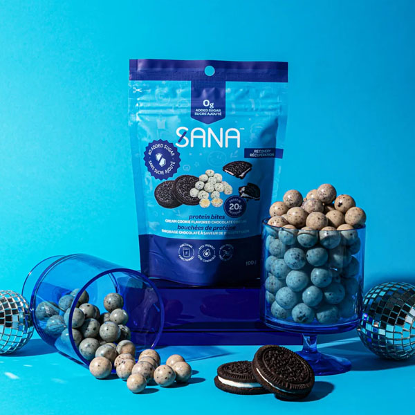
The agency designed colourful, eye-catching packaging that promotes Sana as a young, vibrant and dynamic brand.
“We had a lot of fun developing this brand that endorses guilt-free pleasure. Bright colours, round font and fun graphics make up Sana’s healthy, happy, gourmet world.” – Phil Jones, Creative Director at Braque.
Sana is now ready to introduce a whole new group of consumers to its benefits and great taste, not only in Québec but in other markets as well.